LocketGo is a Canadian smart locker company providing convenient personal storage and parcel delivery solutions. Founded in 2016, the company’s original website no longer reflected its growing professionalism and brand maturity.
As LocketGo expanded its customer base, the team identified the need to revamp both its brand identity and website to communicate trust, clarity, and reliability. To achieve this, the project focused on user-centered design, strategic UX research, and a modern, intuitive website experience.
3.5 months
Website redesign & brand alignment
Web Designer
Responsive Web / CMS
The website redesign translated research insights into actionable design directions focused on enhancing LocketGo’s brand presence, guiding visitors, and supporting conversion goals. Strategy centered on prioritizing the most important information, creating a clear visual hierarchy, and building trust through transparency, ensuring the site not only looked professional but also delivered a seamless, engaging experience for potential clients.
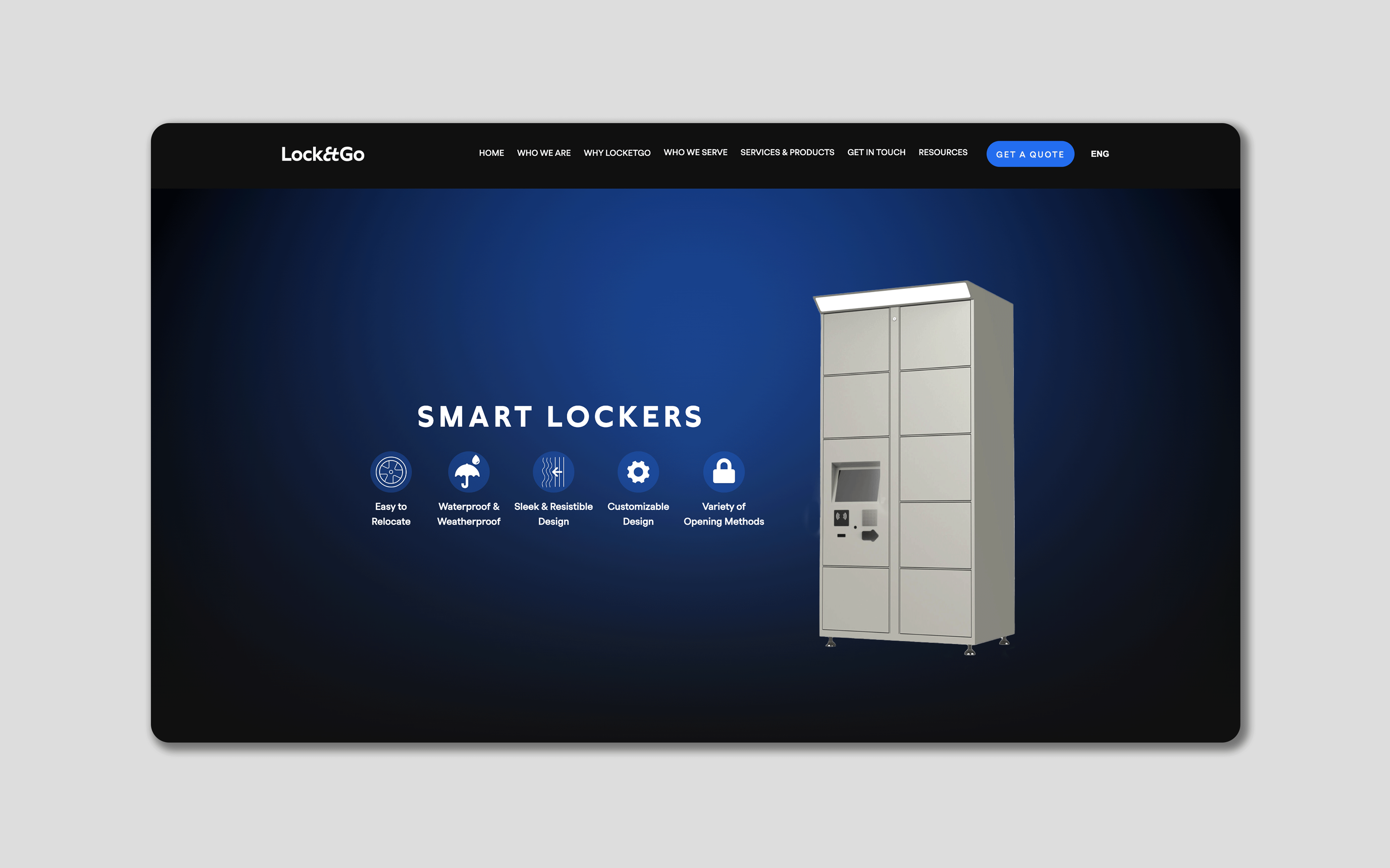
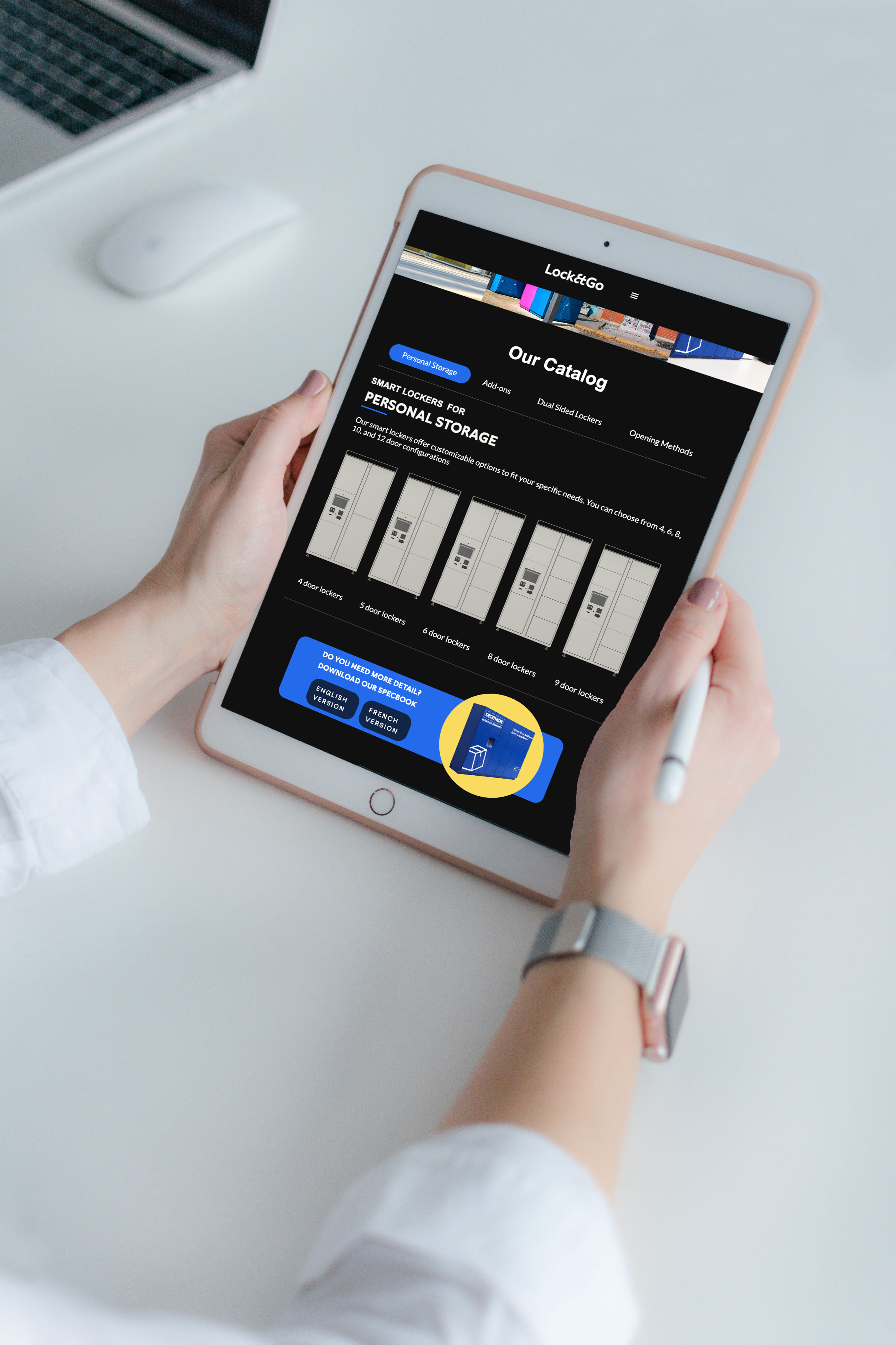
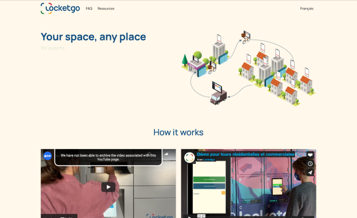
LocketGo's product has real depth: hardware, software, customization, and two distinct use cases (venues and parcel delivery). The challenge was presenting that without overwhelming a first-time visitor. I structured the site so the homepage answered "what is this and who is it for?" in the first scroll, with each subsequent section going one level deeper. Features are introduced in context, tied to a specific customer benefit rather than listed as a spec sheet.
For a B2B company asking clients to install physical hardware at their venue, trust is everything. I prioritized social proof early in the page hierarchy. Client logos from recognizable brands like Evenko and Decathlon appear above the fold, and testimonials are placed near conversion points rather than buried in a separate page. Adding a "Request a Quote" entry point gave cautious visitors a lower-friction way to engage than a generic contact form.
The original site treated all visitors the same. But LocketGo actually has two quite different audiences: venue operators and parcel carriers. I restructured the navigation to reflect that, with a "Who We Serve" section that lets each audience self-identify and find relevant information quickly. This reduced the cognitive load of the homepage while making both audience types feel directly addressed.
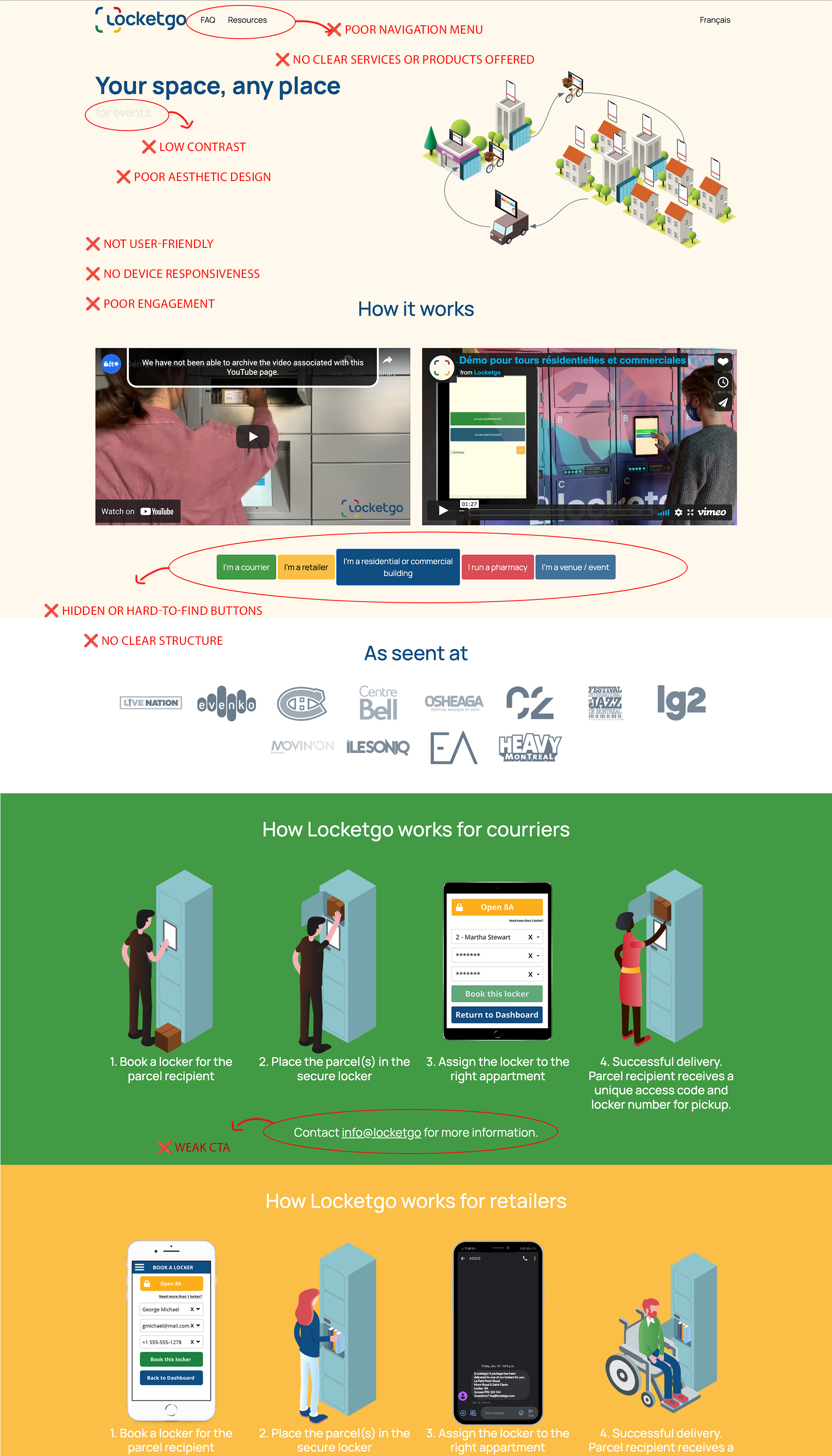
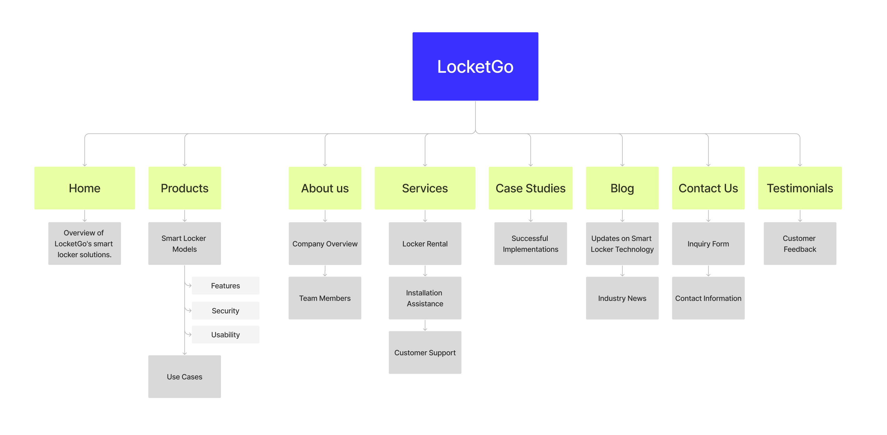
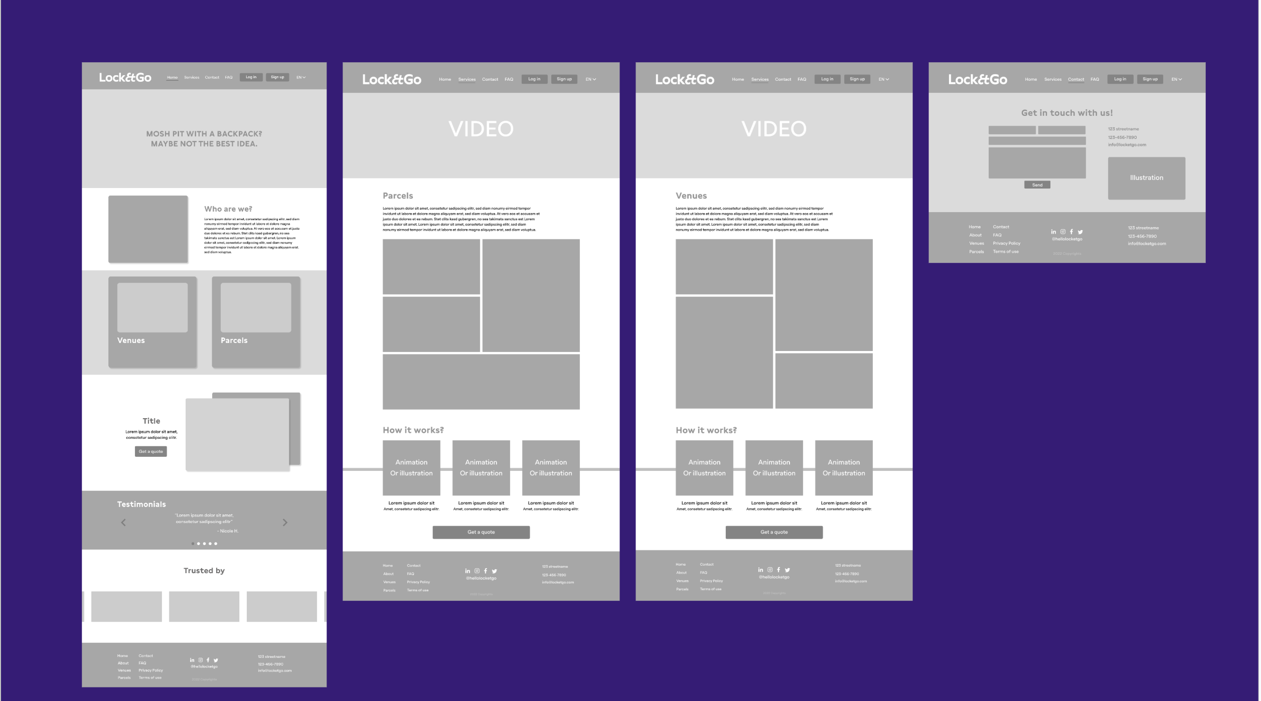
Before anything else, I needed to understand why the existing site wasn't working, not just that it looked dated, but what specifically was causing visitors to disengage. I audited the current content for clarity, hierarchy, and trust signals, and reviewed how competitors in the smart locker and B2B service space structured their sites. The audit made one thing clear: the site was organized around LocketGo's internal product categories, not around what a potential client actually needed to know to make a decision.
The most important structural decision was splitting the navigation around audience type rather than product type. A venue operator and a parcel carrier have completely different questions - different use cases, different concerns, different buying processes. By creating a "Who We Serve" pathway in the nav, I made it possible for each visitor to find their version of the story without having to filter through irrelevant content. The sitemap also elevated credibility content (client cases, testimonials, FAQ) to be discoverable within the main navigation rather than hidden in the footer.
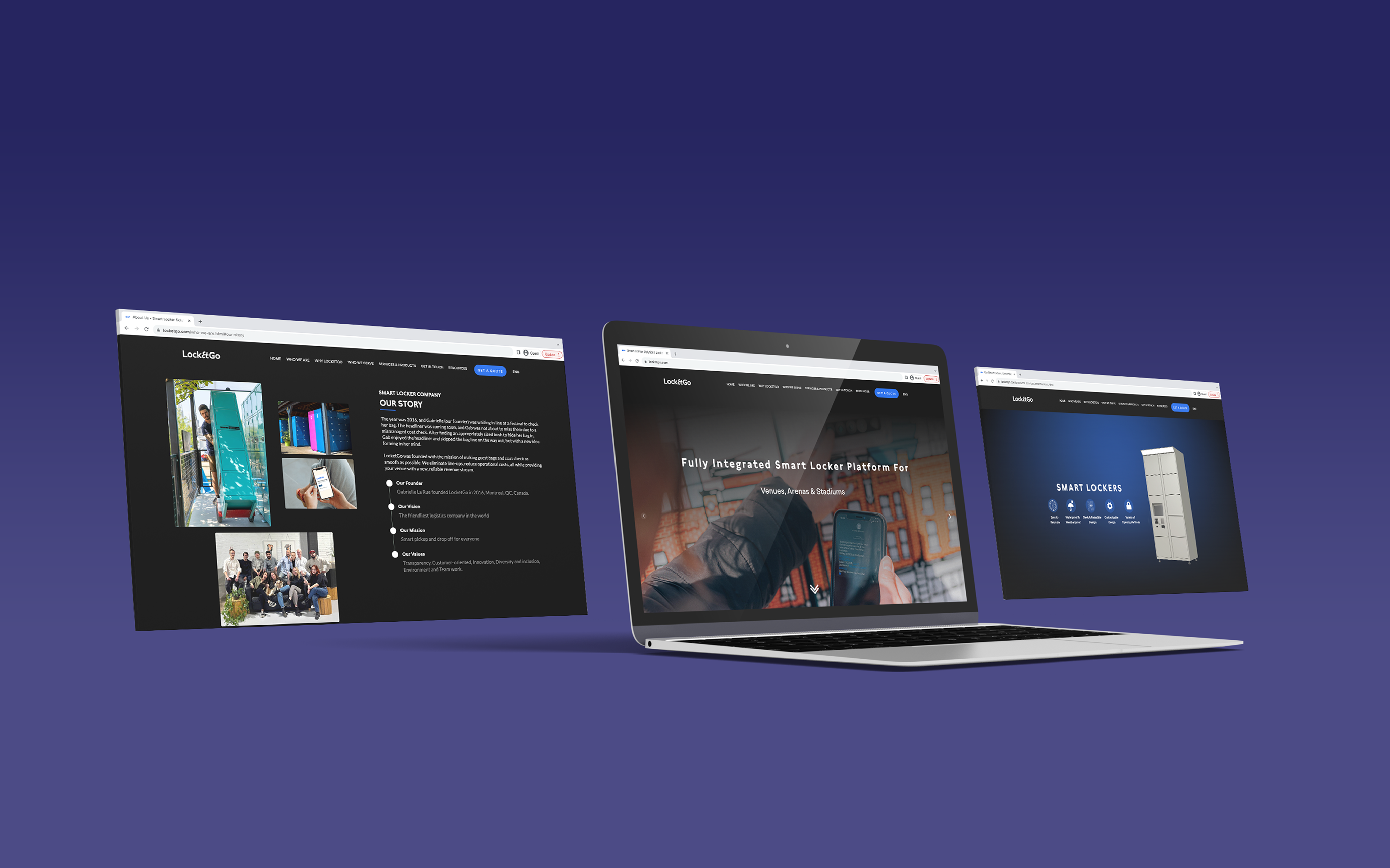
I tested layout and hierarchy through lo-fi and mid-fi wireframes before committing to visual decisions. The key tension in the visual design was between approachability and professionalism. LocketGo serves everyone from water parks to corporate retailers, so the design needed to feel credible without being cold. I landed on a clean, high-contrast visual system with strong photography of the physical lockers in real client environments, because showing the product in context communicates scale and trust faster than any copy could.
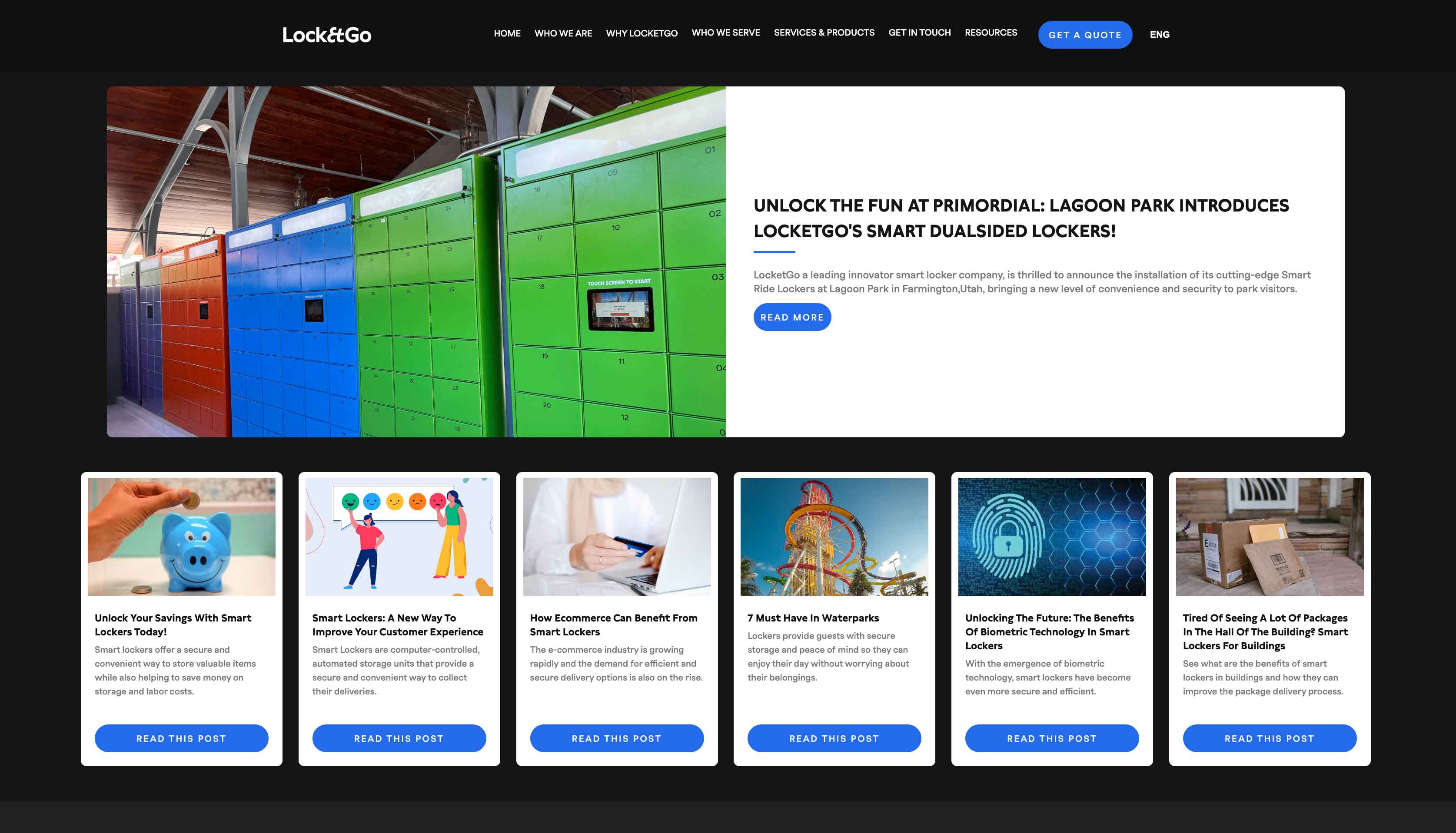
The final solution was implemented using a hybrid architecture: dynamic CMS collections were leveraged for high-frequency content such as blogs and case studies, while core product and informational pages were structured as static templates. Given that the platform operated as a product catalog rather than a transactional e-commerce site, this approach balanced flexibility with performance and simplicity.
Design systems, reusable components, and modular templates were intentionally structured to ensure visual consistency, responsive integrity, and scalable growth. This foundation allows the website to evolve seamlessly as LocketGo expands its product offerings and content strategy.
The biggest design decision on this project was treating the two audiences, venues and carriers, as distinct rather than forcing them through the same funnel. That structural choice shaped almost everything else: the navigation, the homepage hierarchy, the CTAs, and which social proof appeared where. In hindsight, I would have pushed for even earlier stakeholder interviews with actual LocketGo clients to validate those audience assumptions before finalizing the IA (Information Architecture) but the research we did conduct pointed strongly in the right direction, and the feedback after launch confirmed it.
Prior to the redesign, only 17.5% of surveyed users had visited the site, 88% perceived it as lacking professionalism, and 68.7% felt it didn't provide enough information to make a decision.
The redesign directly addressed each of these gaps - clearer content hierarchy, visible social proof from recognizable clients, and a navigation structure built around how visitors actually think about their problem. The result is a website that now works as a genuine sales tool, not just a digital placeholder.