10 months
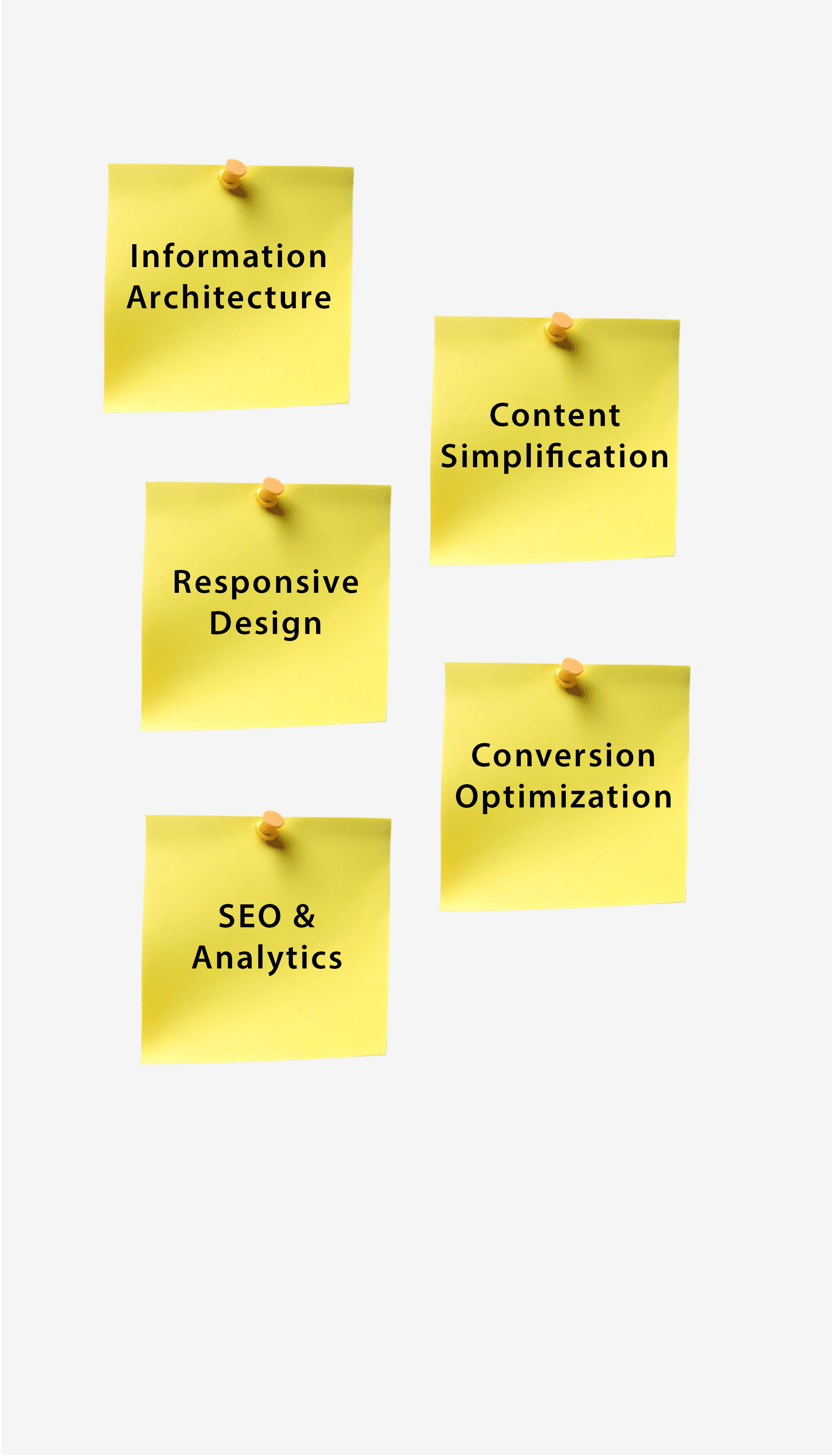
Website redesign, CMS, SEO, analytics
UX/UI Designer
Responsive Web / CMS
The redesign focused on translating technical complexity into a structured, user-friendly experience while aligning the website with business goals.
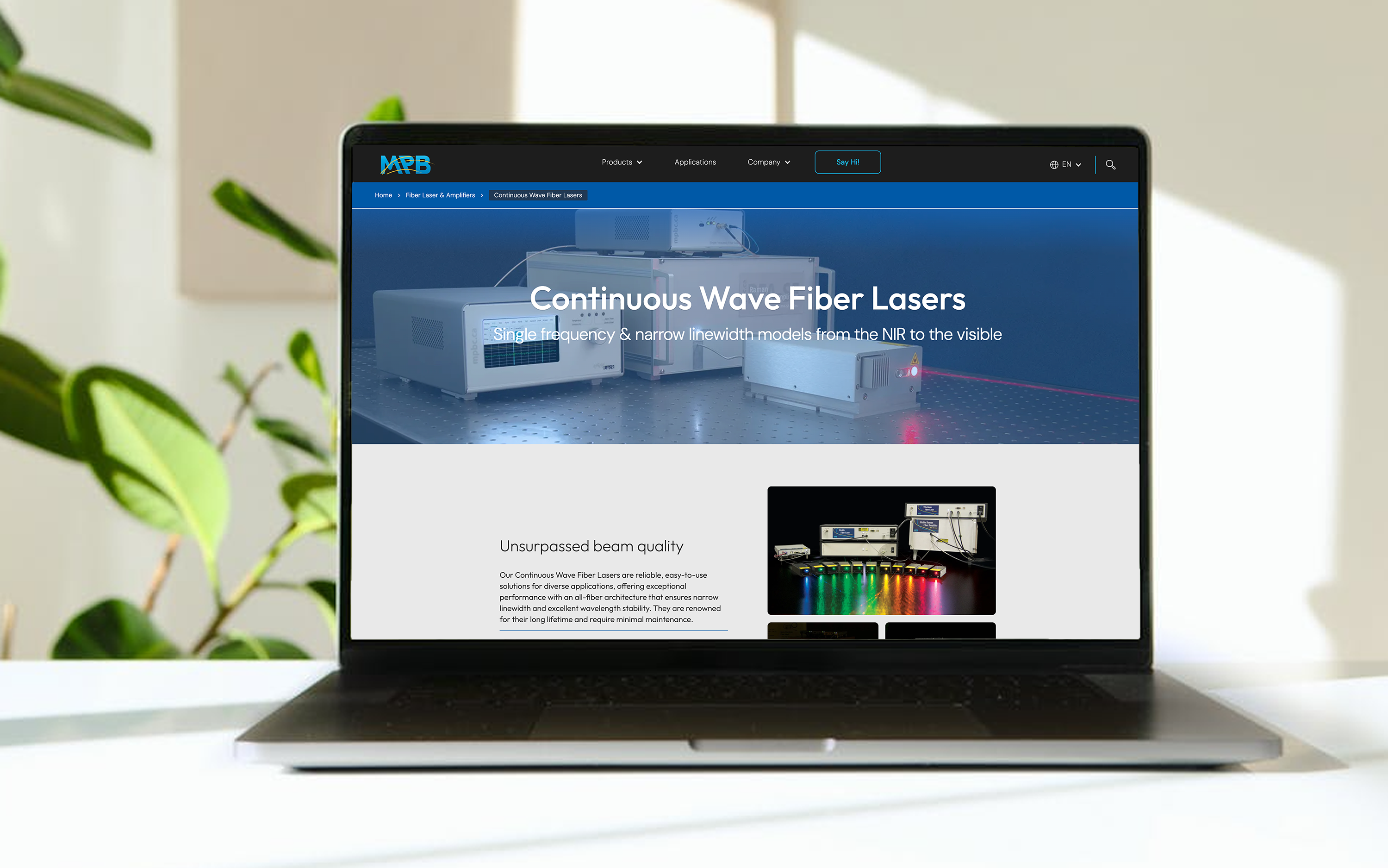
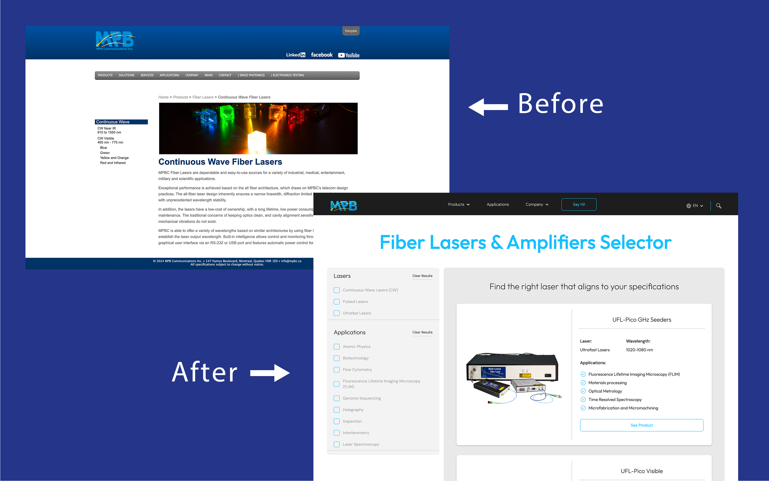
The challenge wasn't removing technical detail, it was layering it. I designed product pages so a decision-maker gets a clear summary first, with deeper specs one step further in. A modular card layout lets users self-select their path without being overwhelmed upfront.
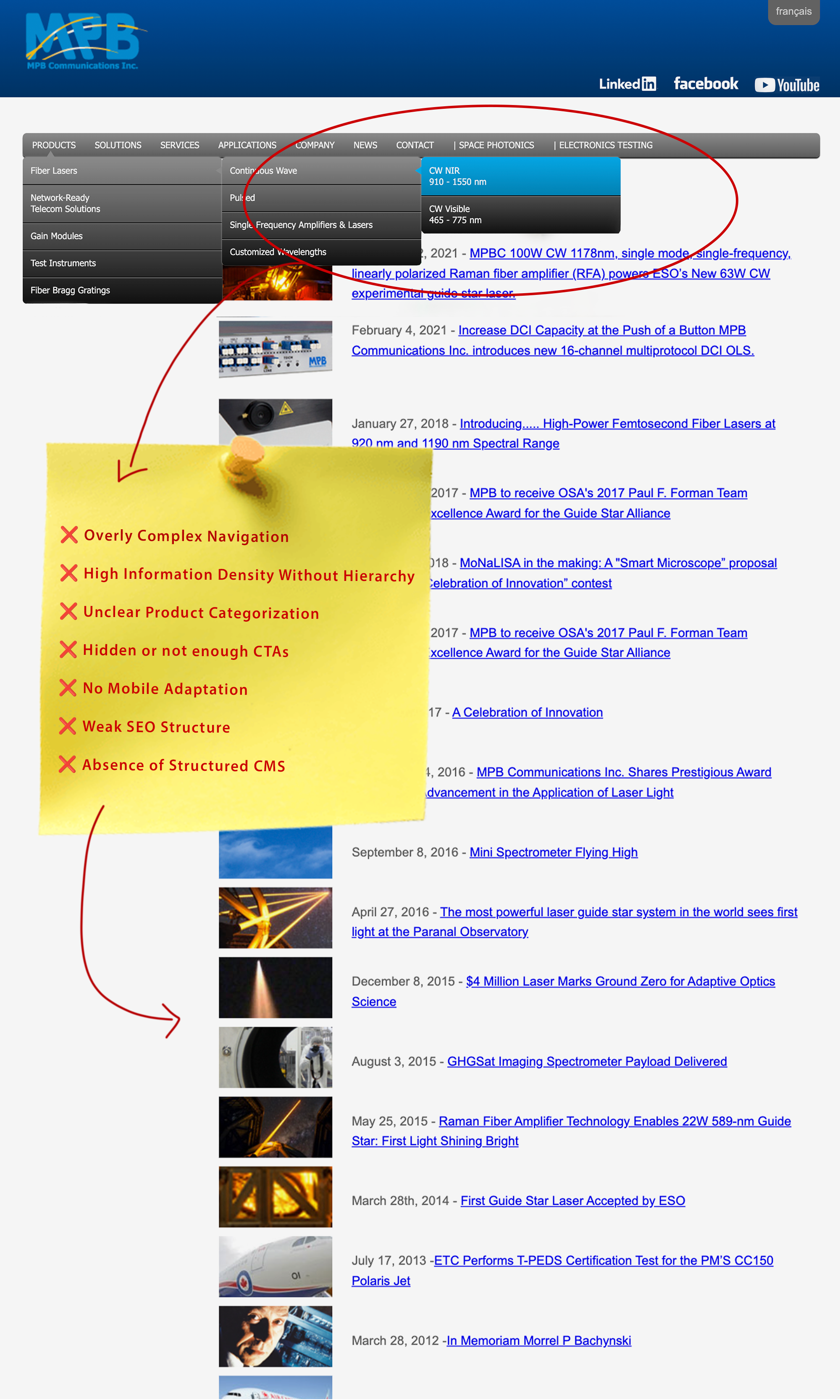
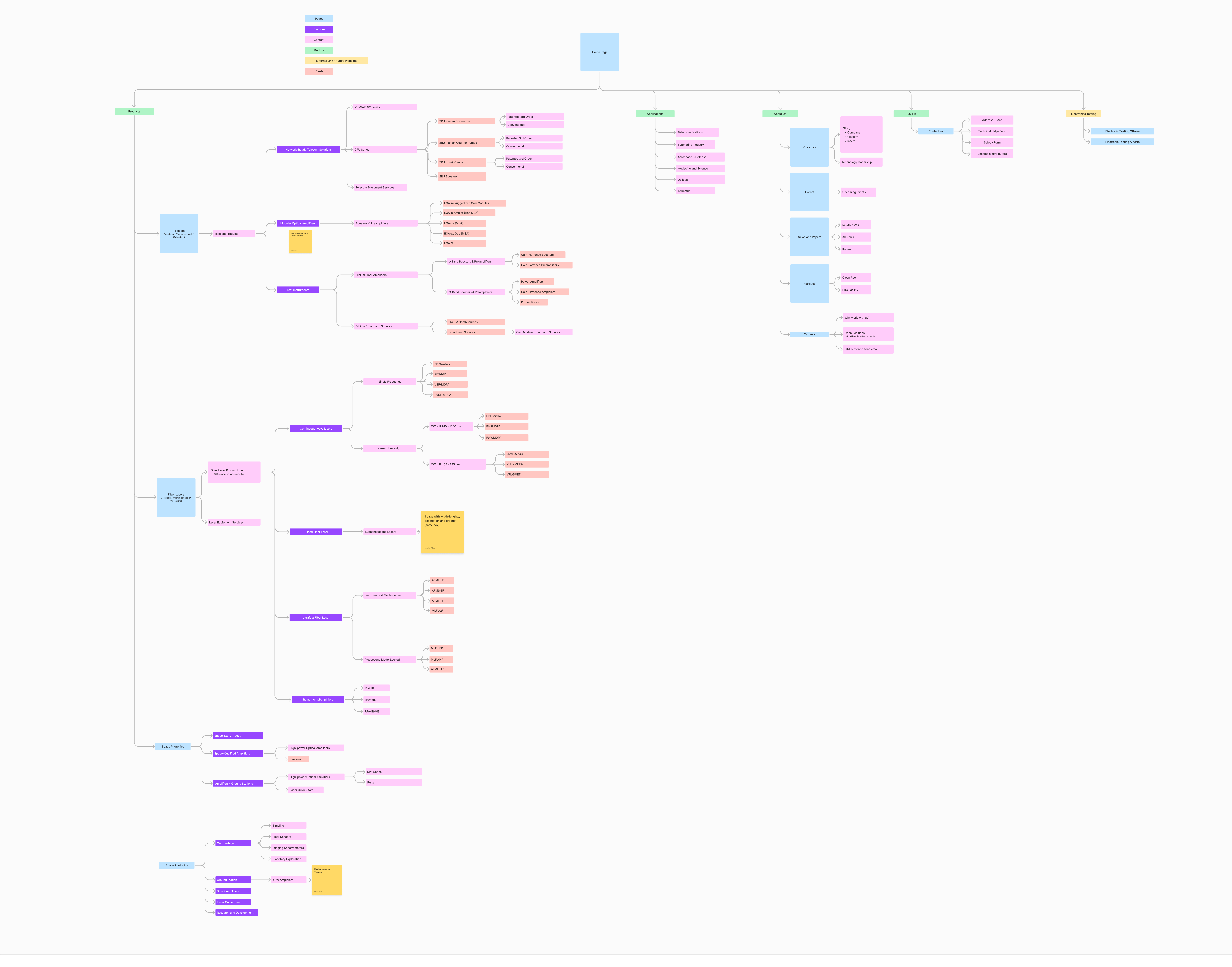
The original navigation reflected how MPBC organized their products internally, not how buyers search for solutions. I restructured the sitemap around use cases and industries instead, so users could arrive with a problem in mind and find their way without already knowing the product name. This also aligned directly with how people search on Google.
The existing site had CTAs, but they were easy to miss and appeared before the user had context to act on them. I redesigned them to be visually prominent and repositioned them at natural decision points. I also introduced inquiry forms entirely, giving users a direct, low-friction way to get in touch without having to hunt for contact information.
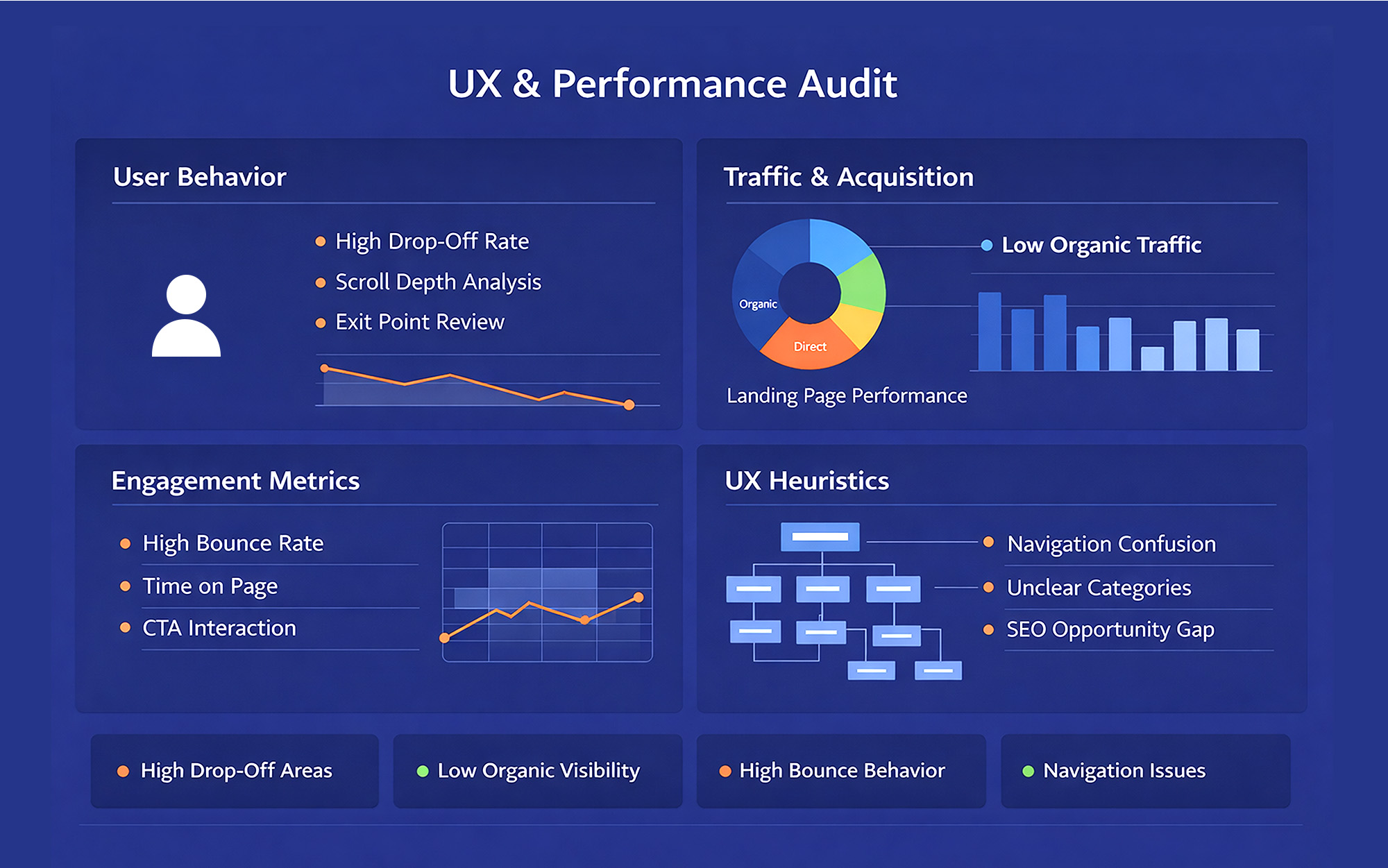
I started here before touching any design because I wanted to separate what I was observing from what the data was telling me. My heuristic evaluation gave me hypotheses; the analytics gave me evidence. In several cases the data surprised me, pages I expected to underperform were getting traffic, they just weren't converting. That told me the problem wasn't discoverability, it was clarity and hierarchy once users arrived. Starting with the audit saved me from redesigning things that didn't need to change.
The site needed to serve multiple audiences simultaneously - telecom engineers, photonics researchers, and space industry buyers, each looking for very different things. I restructured the navigation into three clear product pillars (Telecom, Fiber Lasers & Amplifiers, and Space Photonics) so users could orient themselves immediately based on their field. A separate Applications section was created to bridge the gap for users who arrive with a use case in mind rather than a product name. I also accounted for the bilingual requirement (EN/FR) in the sitemap structure from the start, so the architecture could scale cleanly across both languages.
I started wireframing at mobile width first, which forced early prioritization decisions. When you only have a narrow viewport to work with, you can't rely on a wide layout to absorb content density, you have to decide what matters most on each page. That constraint actually improved the desktop design too, because it established a cleaner content hierarchy from the ground up.
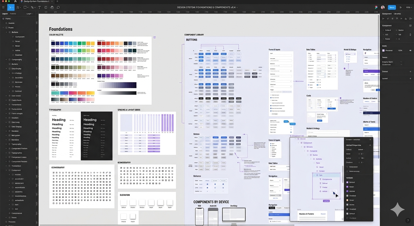
For the UI, I kept the visual language professional and restrained. MPB's audience (engineers, researchers, and technical buyers) responds better to credibility than to visual flair. Clean typography, clear product photography, and structured layouts were the right choice for building trust with that specific user base.

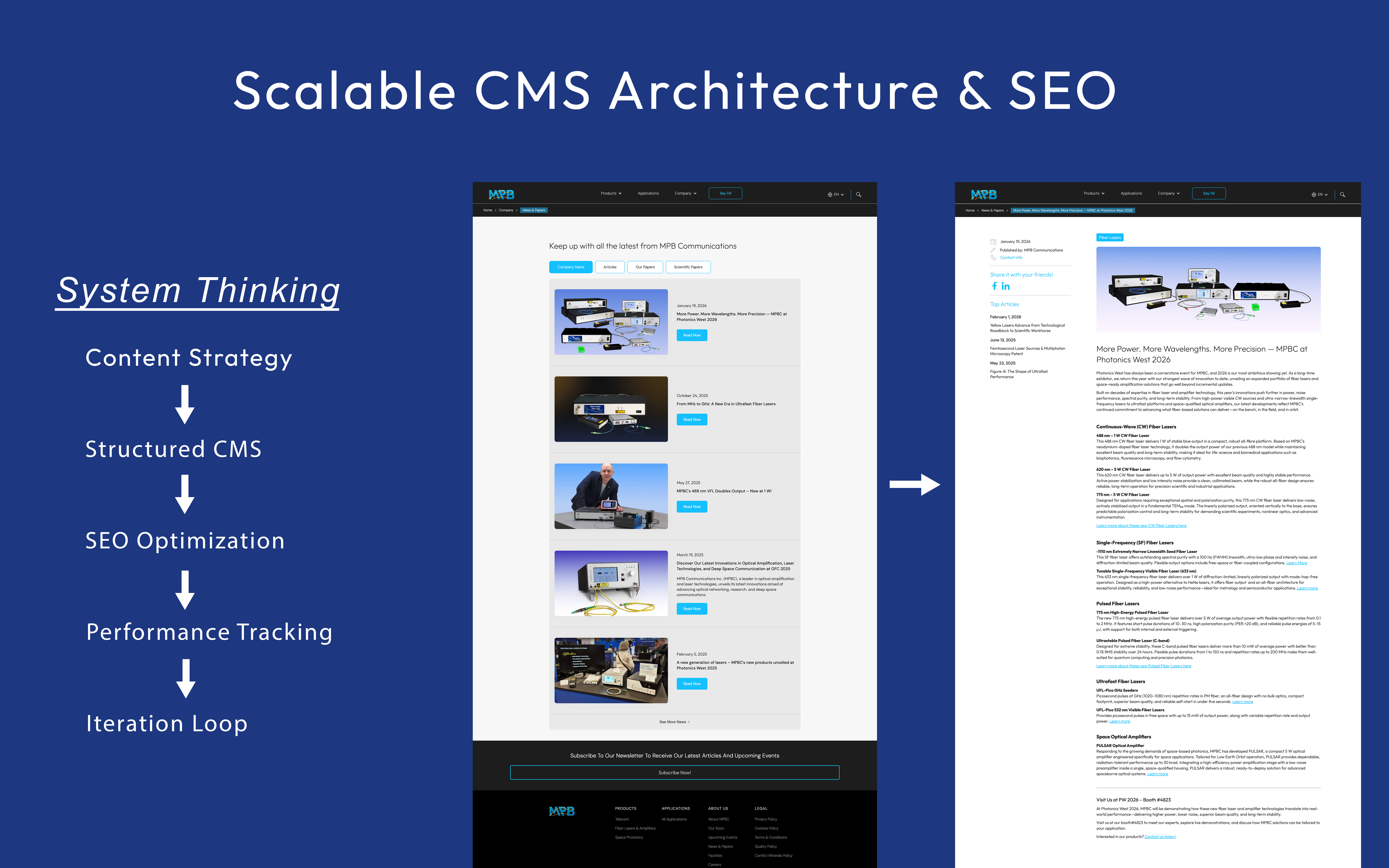
I structured the CMS so that MPB's internal team could manage and update product content, news, events, and papers independently after launch, without needing a developer for routine updates. Given the volume of content categories on the site (products, applications, news, events, careers), getting the content model right before finalizing the UI components was essential. If the CMS structure doesn't match the design structure, that handoff breaks quickly.
SEO was implemented at both the structural and content level. Page hierarchy, metadata, and internal linking were all configured to support visibility for highly specific technical search terms. Analytics tracking was set up from day one so we had a clear baseline to measure against and keep optimizing post-launch.
The biggest lesson from this project was that designing for a technical audience doesn't mean designing a technical-looking website, it means respecting their intelligence while removing the friction that slows them down. The users who landed on MPBC's site already knew they had a problem to solve; my job was to make it as easy as possible for them to confirm that MPBC was the right solution and take the next step.
I'd also do one thing differently: I would have pushed for user testing with actual buyers earlier in the process, not just stakeholder reviews. The stakeholders knew the products deeply, which meant they sometimes had blind spots about what a first-time visitor needed to see. More external testing earlier would have surfaced those gaps sooner.
Following launch, MPB Communications experienced significant performance growth:
Desktop traffic increased by 264% and mobile traffic grew by 158% — directly validating the responsive redesign and restructured information architecture.
These results confirmed that the core hypothesis was right: the problem was how the website was communicating their products. With a clearer structure, better content hierarchy, and measurable tracking in place, the site became an active part of MPBC's sales process rather than a passive digital presence.