Every design system I have built started the same way. Not with a component library, not with a Figma file, and not with a freshly scaffolde project. It started with a question: what decisions are we making over and over again? That question is the foundation. Everything else is structure built on top of it.
I have seen teams ship a hundred components in record time only to watch the system quietly collapse six months later. Inconsistencies multiply, spacing rules drift, and developers start rolling their own solutions because the library stopped feeling trustworthy. The problem is rarely effort. The problem is sequence. When you build components before you have established the principles they are meant to express, you are decorating a house with no walls.
The first thing I do on any design system project is audit existing product decisions. Not the UI itself, but the logic behind it. Why is this button this tall? Why does this color exist? Why are there four different card layouts doing essentially the same job? I am looking for the implicit rules a team has been following without knowing it.
This process surfaces what I call decision debt: the accumulated cost of choices made in isolation, without a shared system to anchor them. Before a single component is scoped or a style is named, that debt needs to be acknowledged. It shapes the entire architecture to come.
A design system is not a library of components. It is a library of decisions, and components are just how those decisions get shipped.
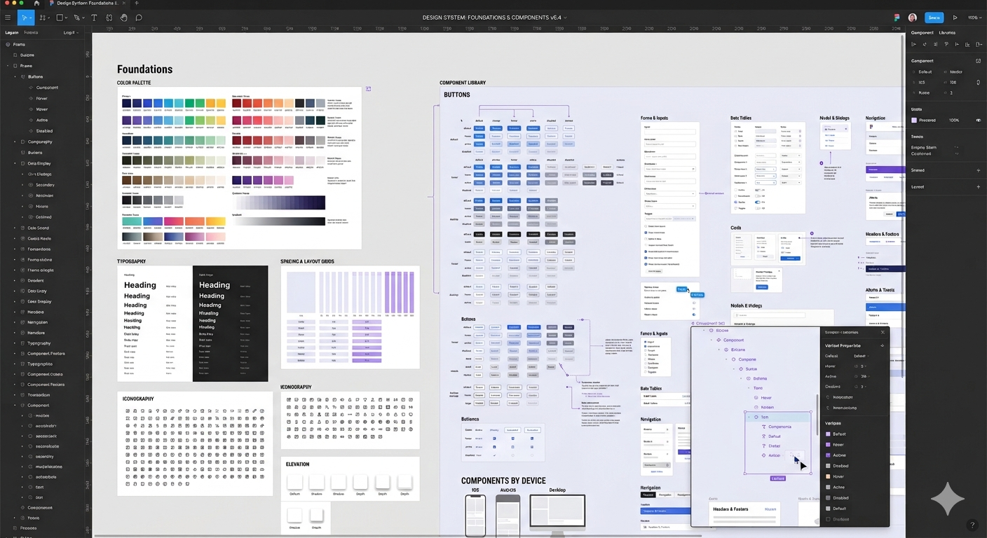
In Figma, I work in layers. Local styles and variables come first, covering color, typography, spacing, and border radius. These are the raw values that everything else references. From there, I build semantic groupings: which color is an action color, which is a feedback color, which is purely decorative. Naming these clearly is not a formality. It is the difference between a system a collaborator can read and one they have to decode.
Components come after styles are settled. Each component is built with variants that map directly to real use cases: size, state, theme, context. Accessibility requirements are part of the spec at this stage too, not an afterthought. Focus states, contrast ratios, and interaction guidance are baked into the annotations before anything moves forward.
My Figma system structure
Once the Figma system is solid, I bring it into the production platform with the same structural logic, whether that's Webflow, Framer, WordPress, or a custom HTML/CSS build. The choice of platform depends on the project: its scale, the client's team, and what needs to be maintainable after handoff.
What stays consistent across all of them is the approach. Global styles and text definitions in the production environment map directly to the variables defined in Figma. Class naming follows a clear convention so any collaborator reviewing the project can orient themselves quickly without a guided tour.
This parallel fidelity between the Figma file and the production build is where handoff actually works. There is no translation layer, no interpretation gap. A designer opening Figma and a developer reviewing the codebase see the same decisions expressed in their respective tools. That alignment is what makes a system genuinely scalable rather than just well-documented, and it holds regardless of which platform the project ends up in.
One of the most common mistakes I see is treating accessibility as a checklist to run at the end of a project. In my process, accessibility criteria act as a filter throughout. Color choices are checked for contrast ratios at the token level. Interactive components are designed with keyboard navigation in mind from the first variant. Focus indicators are styled intentionally, not left as browser defaults.
Building this way does not slow things down. It removes a whole category of rework that would otherwise show up late in a project, when it is most expensive to fix.
The pattern I return to on every project is this: go slow on foundations so you can go fast on everything above them. The teams that take time to make implicit decisions explicit are the ones who build systems that get used, trusted, and extended. The ones who skip straight to components are the ones rebuilding the system two years later.
Foundations first. Always.